Cloudflare partnered with Sköna to elevate their enterprise marketing site. As part of the design team, I was brought in to help translate early wireframes into a scalable, responsive component system to ensure layouts worked seamlessly across breakpoints and aligned with Cloudflare’s design language.
Highlights
Helped build a scalable responsive component library for Cloudflare’s enterprise website, translating early creative concepts into reusable UI.
Delivered clean, developer-ready Figma components with responsive behaviors, enabling Skona and Cloudflare to accelerate page production
Designed breakpoint-specific layouts across desktop, tablet, and mobile to ensure accessibility, visual consistency, and hierarchy for complex enterprise content.
.webp)
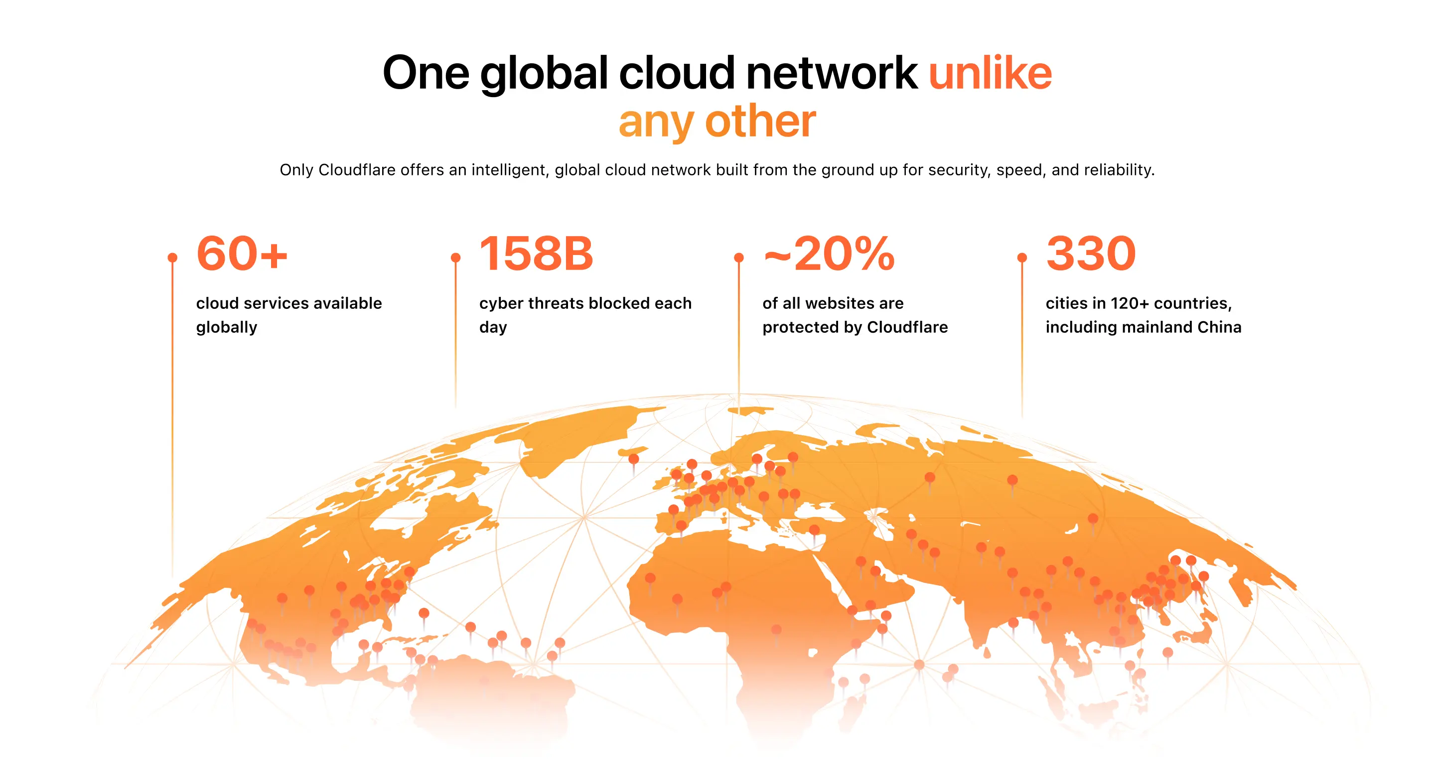
Challenge
I collaborated with Sköna’s design and strategy teams to define a library of repeatable, flexible components that could serve enterprise content needs.
This included:
- + Hero banners
- + Value prop modules
- + Product feature grids
- + Customer proof points
- + CTA sections
- + Resource blocks
- + and more
Each component was designed to be self-contained, adaptable, and ready for future expansion.
.webp)
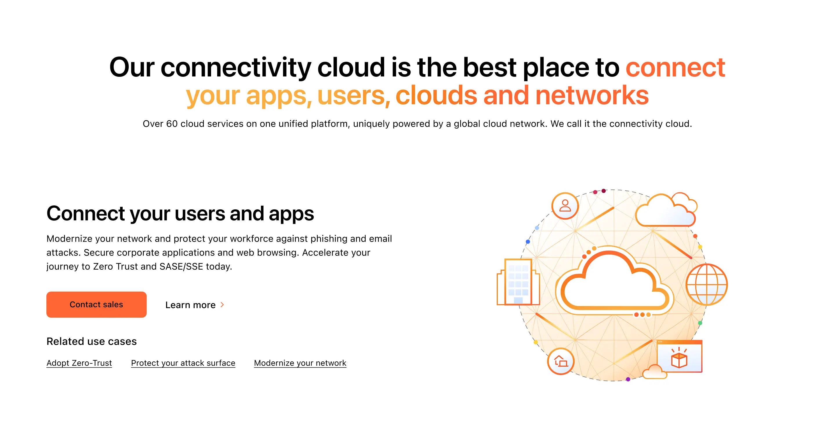
Approach
I translated each component into fully responsive designs across key breakpoints—including desktop, tablet, and mobile.
Key considerations included:
- + Adjusting typography scales
- + Re-flowing multi-column grids
- + Handling image crops and aspect ratios
- + Ensuring visual hierarchy remained clear on small screens
- + Maintaining Cloudflare’s brand consistency throughout
.webp)
Outcomes
This engagement strengthened Cloudflare’s enterprise web experience by establishing a flexible, responsive component system designed to scale. My contributions helped Sköna move from concept to a fully responsive design framework. Ensuring Cloudflare’s enterprise content is accessible and consistent across devices.

Summary
.svg)